As a film director specialising in fashion adverts, Bruno Galán wanted a brand identity that reflected his style—clean and solid—letting the content shine without the need for heavy graphics.
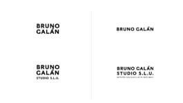
After an initial consultation with Bruno, I developed a brand identity that is both visually appealing and functional. The main goal was to create a design system, not just a logo, along with a colour scheme that would be recognisable and memorable for his audience.


I chose a monochromatic palette of greys, black, white and red, combined with cyan to break the monotony. This kept the colours subtle, yet impactful in their simplicity.
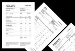
Finally, I created a style guide setting out how the logo and colours should be used across all of Bruno’s branding, including guidelines for typography, logo usage and colour schemes for different media.
As a film director specialising in fashion adverts, Bruno Galán wanted a brand identity that reflected his style—clean and solid—letting the content shine without the need for heavy graphics.
After an initial consultation with Bruno, I developed a brand identity that is both visually appealing and functional. The main goal was to create a design system, not just a logo, along with a colour scheme that would be recognisable and memorable for his audience.

I chose a monochromatic palette of greys, black, white and red, combined with cyan to break the monotony. This kept the colours subtle, yet impactful in their simplicity.
Finally, I created a style guide setting out how the logo and colours should be used across all of Bruno’s branding, including guidelines for typography, logo usage and colour schemes for different media.


Unit 7,
24-28 Pritchards Rd.
E2 9AP
London, UK


Unit 7,
24-28 Pritchards Rd.
E2 9AP
London, UK